Evolving the Brand from the Inside
Aligned CauseLabs’ identity, mission, and UX to help the agency show up with clarity, consistency, and heart.
Touchpoints
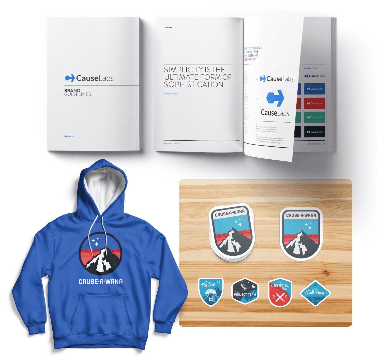
Visual identity and brand guidelines
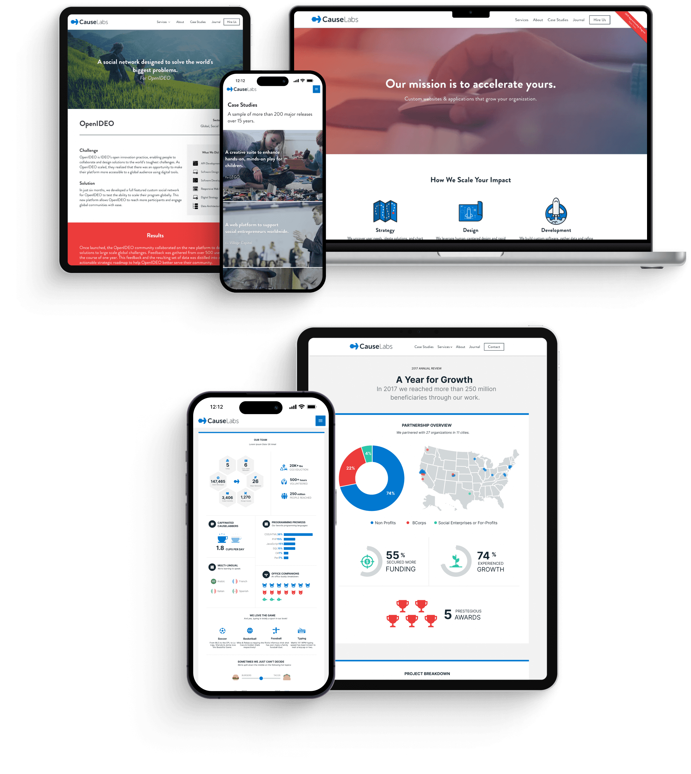
Website redesign and content structure
Messaging frameworks and storytelling assets
Collateral systems and internal templates
Impact
Unified the brand across internal and external channels
Increased clarity around services, values, and voice
Equipped teams to express the brand consistently
Built a flexible system that scaled with the company’s growth

Challenge
CauseLabs had a strong mission and an impressive portfolio of work with nonprofits and NGOs. But their brand was fragmented, and their website did not reflect their purpose or professionalism. The team needed a more cohesive identity, clearer messaging, and a brand system they could confidently use across channels.
Strategic Initiatives
I partnered closely with executive leadership to reshape how CauseLabs communicated and presented itself. My work spanned both strategic and hands-on execution, supporting the brand across every layer of expression.
01
Redefine the identity with clarity and strength
We refreshed the visual identity with a new mark, typography, and color system that felt modern, grounded, and flexible. The new system reflected momentum and collaboration while maintaining CauseLabs’ values-first tone.
02
Create a usable brand system for the whole team
I developed a set of tools and templates that made it easy for any team member to apply the brand without starting from scratch. This included presentation decks, internal documents, and visual standards that could scale with the team.
03
Redesign the website around purpose and action
I restructured the website to communicate services and impact more clearly. The new content blocks supported storytelling and led with outcomes, while the design system reinforced trust and clarity at every step.
04
Extend the brand across product and internal tools
The brand system was applied to CauseLabs’ client-facing work and internal platforms. I worked on UI design for tools like Bible.is, ensuring the values and tone remained consistent throughout the full experience.
Outcomes
I had the privilege of working with Jenna not only on a broad range of client projects, but also on our own marketing and communications initiatives. I came to trust Jenna's design discernment implicitly and can say I gained an even stronger knowledge of visual design strategy and philosophy through our collaborations. Among all the designers I've worked with, Jenna is amazingly gifted at taking on the mission of the project in question and blending it with her amazing creative skill set such that the ideas, metaphors, and concepts she brings to the table come from a deep place of authenticity.
T.J. Cook
Former CEO, CauseLabs
Now Co-Founder, Agentic Studios

CauseLabs Blue
PMS 285 C
CMYK 82, 50, 0, 0
RGB 0, 120, 209
#0078D1
Impact Red
PMS Red 032 C CMYK 1, 92, 81, 0
RGB 237, 59, 59
#ED3B3B
Prosperity Teal
PMS 3258 C
CMYK 68, 0, 46, 0
RGB 40, 198, 168
#28C68A
Precision Black
PMS 5463 C
CMYK 84, 67, 58, 63
RGB 26, 42, 49
#1A2A31


The story finally matched the impact.